Utilisation
Description
Integrated HR solution that combines time management and reporting functions into a central system.
Year
2023
Client
NCC Group
Services
UX / UI Design
User Research

Description
Integrated HR solution that combines time management and reporting functions into a central system.
Year
2023
Client
NCC Group
Services
UX / UI Design
User Research

Problem, challenge, and solution
Understanding the problem, evaluating potential solutions, and familiarising myself with the user's perspective.

What challenges must the business address and overcome?
Working in collaboration with the Product Manager, our objective was to pinpoint the challenges within business.
The organisation requires appropriate tools to optimise project profitability, facilitate informed decision-making, and enhance financial performance through detailed insights and meticulous control.
Administrative tasks can be tedious, often resulting in delays or oversights. Integrating automation and email could streamline these processes, enhancing user efficiency and allowing them to concentrate on core tasks.
How can we efficiently centralise and process our diverse data sources into a unified platform, allowing us to make informed, data-driven decisions and gain valuable, impactful insights?
User interviews & persona development
To gain a comprehensive understanding of our users, we conducted interviews with key personnel including the Chief Information Officer, Head of Global Applications and Software, Senior Product Managers, and Software Engineers.
Goals: To ensure the adoption of the platform across the whole of the business.
Goals: View work, costs, team hours, and export data. Manage products, users, and cost levels.
Goals: Visualise time, plan projects, and assess team capacity effectively.
Goals: Effortlessly record weekly activities and gain insights into how my time is allocated.
Key requirements
I conducted brainstorming sessions to generate feature ideas. Afterward, we prioritized features based on user needs and feasibility.

Principles
Simplicity in design enhances user navigation and product effectiveness, and can significantly influences a product's success. Complex and unintuitive products tend to fall short, resulting in reduced interest, and engagement.
Information must be clear, comprehensible, and logically presented to prevent user confusion or overwhelm. Our goal is not only to facilitate easier information consumption but also to enhance its accessibility.
Functional design is now pivotal in modern workplaces. Prioritising functionality and practicality in our products fosters efficiency, comfort, and productivity in the work environment.
User journey

Allocations page

Team allocations page

Editing a team members allocations modal
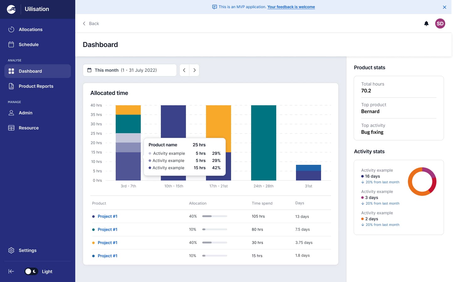
Allocations & dashboard
Effortlessly record weekly activities and gain insights into how time is allocated


Schedule & resource
Visualise time, plan projects, and assess team capacity effectively.


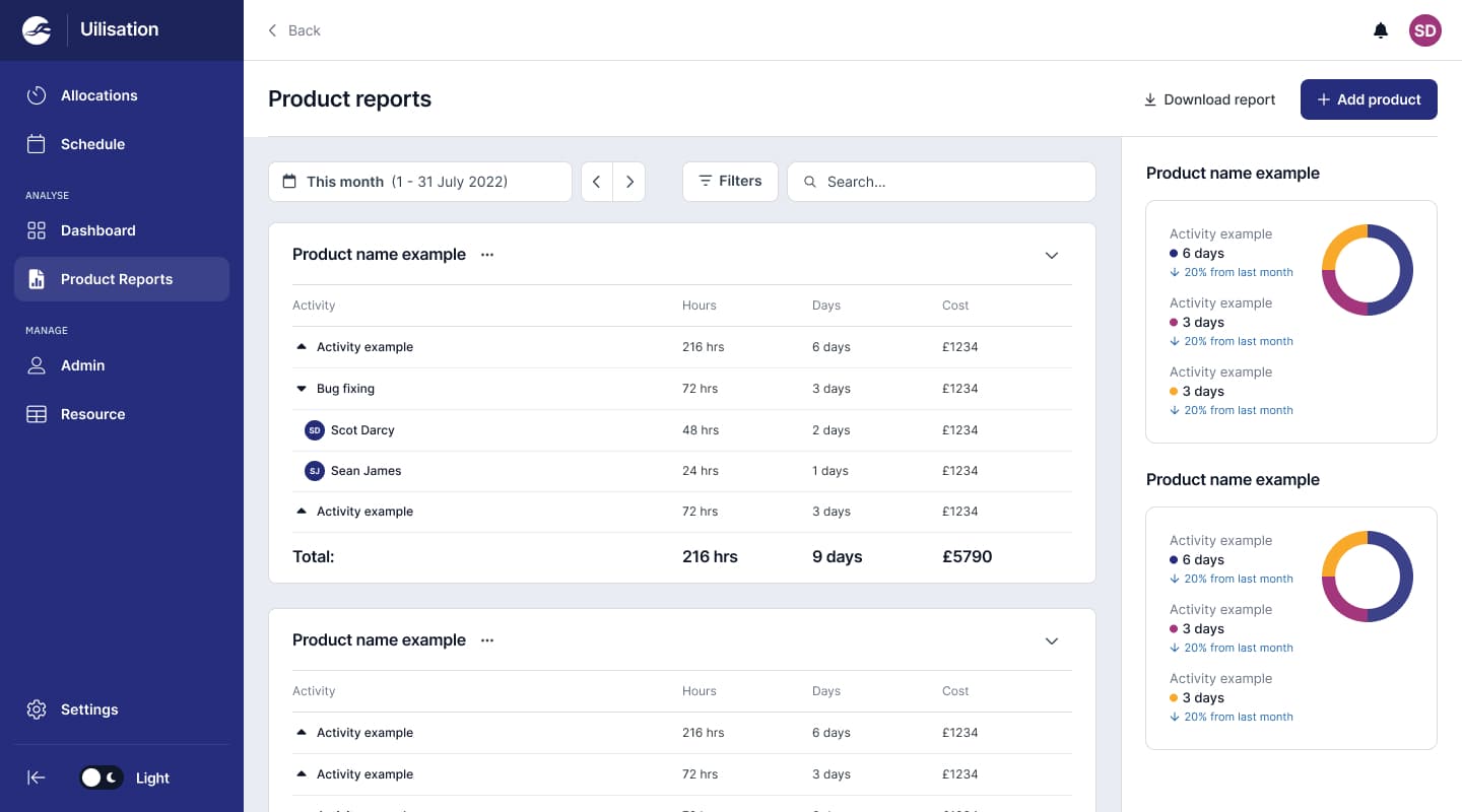
Product reports & admin
View work, costs, team hours, and export data. Manage products, users, and cost levels.


Prototyping & user testing
I created a prototype to simulate the final product so we could reveal areas of confusion and uncover pain points in the product to highlight opportunities to improve the overall design
Feeling micromanaged
In earlier designs, our allocators perceived time-tracking as an effort to scrutinise. To address this, we modified the platform to display weekly percentages instead of daily hours. This change ensured comfort for the allocators while still providing valuable insights for the business.
Streamlining features
Users desired an efficient and streamlined product. We achieved this by enabling users to replicate previous week's allocations and by auto-prioritising recent projects in the dropdown menu. These features aimed to reduce administrative hassles, allowing users to focus on other primary tasks.

Design handover
Collaborating with developers, I conducted handover meetings, annotated my designs for clarity, and provided them with any necessary flows or prototypes.

Logo design
After the initial release of the Minimum Viable Product (MVP) version of the platform, I was entrusted with the responsibility of creating the logo for the product.
After the initial release of the Minimum Viable Product (MVP) version of the platform, I was entrusted with the responsibility of creating the logo for the product.

Business impact / key indicators
Allocators
Frequent use of the platform. Users can successfully complete the tasks they set out to do. Minimal users missing deadlines for weekly allocations. Minimal user errors
Finance & Report Viewers
Minimal time to pull reports showing product utilisation costs. Displaying correct utilisation costs without any need to cross check with senior management. Positive feedback when checking with team that the platform is doing what they need. Reduced time for updating users Utilisation sheets. Frequent usage of product report feature.
Admin & Wider business
Efficiency when actioning CRUD across the platform. Effectively able to liaise and work with the Finance team across any data discrepancies. Positive feedback from survey. The wider business knowing about the platform - more engagement and onboarding from wider teams
